
Posted by: Ash Fielder
23 February 2024
How can Financial Services Companies Attract Potential Clients?
The Wealth Management market is projected to grow significantly in the coming years, with an anticipated CAGR of 7.92% from 2024 to 2028, in the US alone. This growth, combined with the rise in personalized financial planning, is leading to stiffer competition.
Wealth managers and other financial service providers can stay competitive by investing in a digital strategy. This could include a well-crafted website that highlights their unique services and fosters trust, attracting potential clients and encouraging loyalty.
Critical factors for success include a strong user experience, distinctive branding, strategic content planning, and robust technology.
We've collated 14 top examples of finance websites and solutions to inspire your digital strategy, alongside key takeaways to help you develop an optimal solution and broaden your total addressable market.
Top 16 Finance Website Design: UX Overview
- Skybound Wealth
- Saltus
- Zoefin
- Facet
- Alti Global
- Ethenea
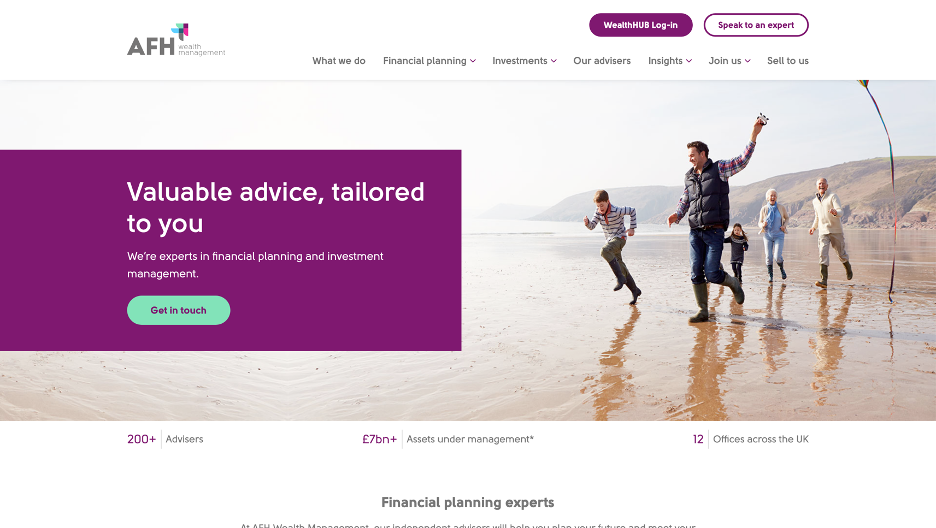
- AFH Wealth Management
- Evelyn
- Quintet
- Apex Group
- Iolcus
- Momentum
- Bowmore
- FE fundinfo
- Quilter
- Zenus Bank

What is User Experience (UX) Design?
User experience (UX) design refers to the process used to create products, systems, or services for the user. It includes all user interaction aspects, including usability, accessibility, efficiency, and satisfaction. UX design aims to make users happy by meeting their needs and expectations with a positive and meaningful experience.
Ash Fielder, Senior UX Designer, Growcreate
1. Helping the user answer questions
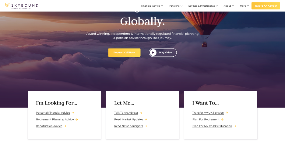
In addition to its clean presentation, this site effectively addresses potential questions from visitors. It directs them to answers immediately using three key boxes, each containing three conclusions. This streamlined design enables focused visitors to quickly find the information they need. By presenting itself in an assistive manner, Skybound Wealth fosters an early supportive relationship with users.
Takeaway: Framing the navigation as the user perceives it reduces friction.
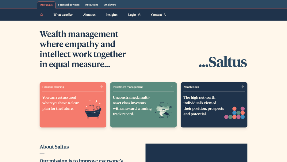
2. Lead with unique branding
This website deftly avoids the stereotypes of wealth management platforms through its unique and excellent brand execution. With its appealing colors, typography, and standout mixed media illustrations, it clearly distinguishes itself from competitors. While this might deter some, it will undoubtedly attract a specific audience, leading to greater success within that market segment.
Takeaway: Presenting a strong and unique brand identity can quickly build a more loyal audience.
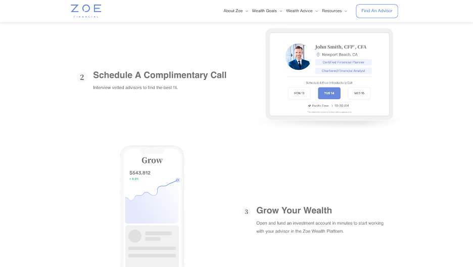
3. Simplify your offering
Zoefin understands its audience: busy high earners. The company ensures that its homepage provides a straightforward journey with clear calls to action (CTAs). It confidently presents its proposition with a clear offering and simple images without taking up too much space on the page.
Takeaway: Making a complex process feel simple from the outset can put your prospects at ease.
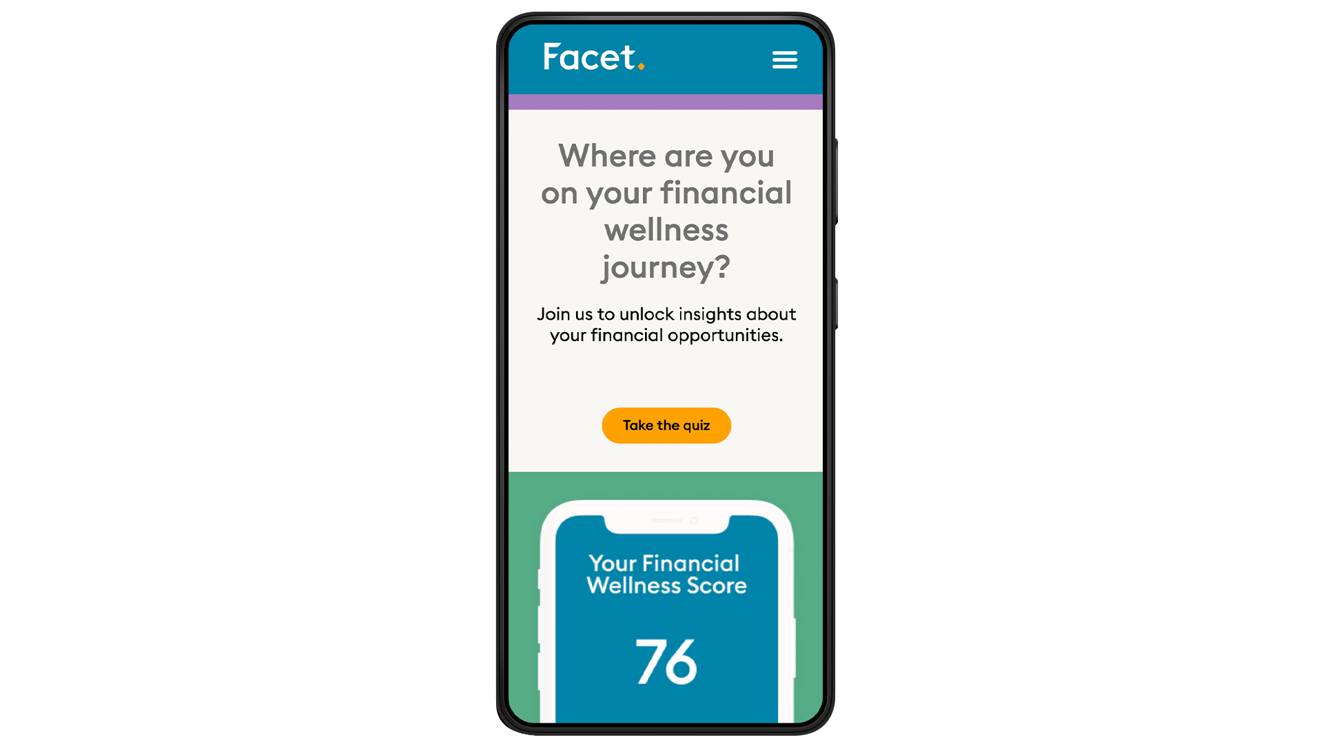
4. A clean mobile experience
Today, most websites are responsive and compatible with nearly all devices. However, that doesn't necessarily equate to an optimal user experience across all platforms. Facet prioritises its mobile experience by featuring accessible buttons and navigation, clear contrasting colors and typography, and straightforward actions. By emphasising a positive and user-friendly mobile experience, they can tap into markets that predominantly use mobile for internet engagement and attract a younger audience.
Takeaway: Emphasising a mobile-first approach broadens your business reach.
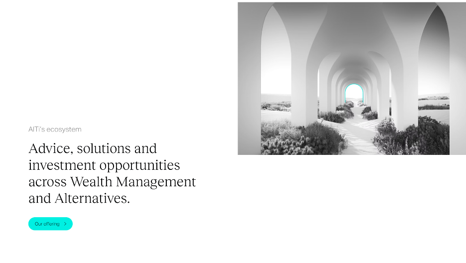
5. Make a minimal approach for a bold statement site
Alti Global uses striking typography and minimal elements, creating a clean and simplified user experience. It excels in removing extraneous elements and utilising white space, directing the user's focus and evoking a sense of vastness. The layout employs a screened approach instead of the traditional scroll, isolating each step on the home page and eliminating the feeling of scrolling through an endless page. Consistent branding and the use of unique landscape photography contribute to an otherworldly, spacious, and distinctive presentation.
Takeaway: Enhance user focus on journeys by elegantly concealing unnecessary elements.
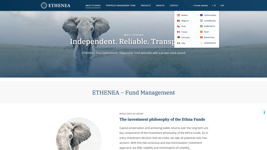
6. Ensure consistency across multiple languages
Ethenea is an excellent example of a site that prioritizes accessibility for various countries through its robust multilingual platform. It supports 12 different languages and has created a streamlined content journey, which improves SEO and reduces the need for content editing.
Takeaway: Prioritise having only the necessary content and journeys when preparing to translate into other languages.
7. Simplify the journey
Clear navigation and personalised copy can enhance the user experience. High-quality photography adds a personal touch to wealth management.
Takeaway: Pair your imagery and photography to make the journey feel more relatable and personal.
8. Use a full-screen Meganav
If there's a lot of information or offerings, it's crucial to make it easily accessible to the user. This website employs effective splash navigation, providing ample space and facilitating easy navigation to the most relevant pages.
Takeaway: For complex architectures, ensure easy navigation.
What problems can UX solve?
UX, or User Experience, solves loads of problems. It can improve a website's usability, making it easier for visitors to find the information they're looking for. It can also enhance a user's interaction with a product or service, making it more enjoyable and efficient to use.
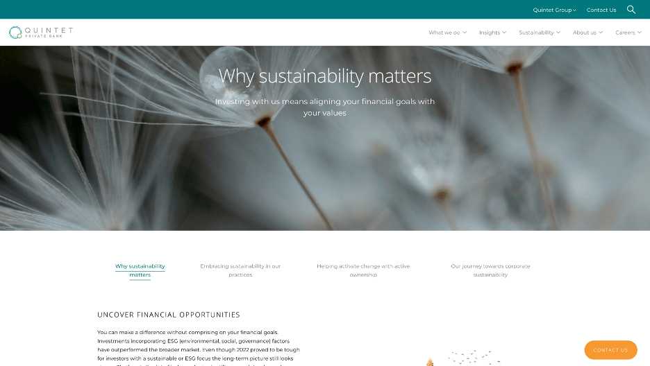
UX design9. Add Sustainability to your offering
Incorporating sustainability as a core strategy in your business is becoming increasingly standard. This website excellently integrates that concept into its theme with photography that emphasises environmental spaces and powerful portrait work. Featuring sustainability prominently in the top navigation sends a clear message about its stance and attracts more prospective clients who share similar values.
Takeaway: Integrating sustainability into your UX can attract prospective clients who share the same values.
10. Adding in a Chatbot for increased journeys
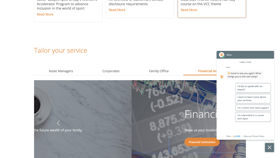
Over the next decade, AI will increasingly be integrated into all solutions. Apex Group's website, for instance, incorporates a chatbot into its platform. This chatbot helps direct queries and navigate clients, easing the pressure on internal teams. According to a study, 74% of customers would choose a chatbot over a human agent for simple questions. This shows that a growing number of financial prospects prefer AI engagement, which can enhance the user experience.
Takeaway: Incorporating a chatbot into your system can improve the experience of prospects and alleviate the load on customer-focused teams.
11. Have an easy customer portal experience
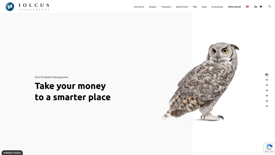
Iolcus offers a clean, easy-to-navigate website that prioritizes the needs of existing customers, making it a seamless experience for those wanting to review their wealth management and portfolios efficiently. The client portal is easy to find and access, providing versatile, quick navigation for users who want detailed information on their funds or just a high-level overview.
Takeaway: Prioritise the experiences of your existing customers and aim to provide them with a satisfying journey.
12. Presenting proof
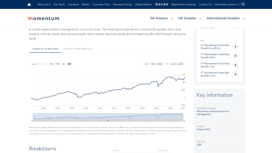
Prospective financial clients value evidence of past success. Momentum commits to full transparency by presenting comprehensive fund information across their portfolios. They use a clean, interactive platform to provide a detailed historical overview of their performance.
Takeaway: Incorporate interactive elements to enable prospective clients to access both high-level overviews and in-depth insights into data.
13. Asymmetrical design
While using grids is familiar and safe, it doesn't always effectively convey your message or make you stand out. Bowmore's unique design helps prospective clients immediately realise that the platform offers something different, keeping them engaged with its ever-changing yet dependable layouts. The section titled with the questions a user would ask is also excellent, helping to guide the user through different journeys and convert quicker.
Takeaway: Utilising asymmetrical design and framing content according to user needs results in a unique and seamless user journey.
14. Engaging Multimedia Content
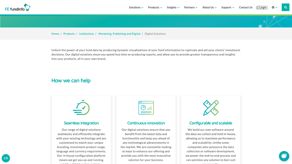
Interactive elements can sometimes be distracting. However, when strategically placed, they can re-engage users who are losing focus. FE fundinfo has integrated interactive SVG graphics throughout the website to engage users at specific points when they may be experiencing fatigue.
Takeaway: Incorporating enjoyable elements into the user journey can enhance focus and increase the time spent on the page.
15. Make your journeys clear for users
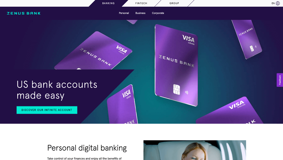
When catering to a diverse audience or expanding into new products or services, it might be tempting to establish a new business or direct audiences to different websites. Zenus Bank effectively uses navigation to delineate clear paths for different users. They aren't shy about being transparent about these different paths, starting from intent (banking, fintech, group) to audience. Their platform maintains consistent branding with uniform shapes and colours, without compromising common UX methods. They offer clear, transparent user journeys.
Takeaway: Be clear and transparent about your different user journeys for your prospects.
16. Support thought leadership to expand customer trust
Wealth management businesses should consider incorporating thought leadership into their strategy to achieve greater success. Quilter exemplifies this approach by creating a hub for their advisors, filled with articles, tools, and real-time information. This hub is easily accessible to prospects, promoting transparency and showcasing their knowledge and skills. The ease of navigation highlights their commitment to making their advisors' lives easier, a sentiment reflected throughout their platform.
Takeaway: Don't hesitate to share internal knowledge externally to demonstrate a knowledge advantage.
Key Strategies for Effective Financial Services Website Design
Setting your financial services website apart from the rest is crucial. One way to achieve this is through a unique and effective UX design. Whether you're developing a new website to showcase services or revamping an existing one, consider the following design elements and strategies:
- User-Friendly Navigation: The website should be easy to navigate, with clear paths to the most important information. This can be achieved with the use of intuitive menus, search features, and well-organized content.
- Clear and Concise Content: The content on your website should be easy to understand and provide value to the user. Avoid using jargon and aim to answer common questions that potential clients may have.
- Strong Visuals: High-quality images and graphics can help to make your website more engaging and can convey complex financial concepts in a more digestible way.
- Trust-Building Elements: Including testimonials, case studies, and credentials can help to build trust with potential clients.
By incorporating these elements into your website design, you can create a powerful online presence that effectively communicates your services, builds trust, and attracts potential clients.